
侧边栏 + 详情
2025-06-19
有时候,设计需要 详情+侧边栏,如:
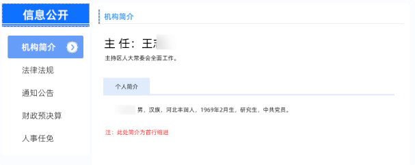
但是根据 2025-05-23 反馈,图文模版(详情)是无法调用 cloumn 的
即下面这段代码不能出现在详情:
html
<hlx-template
  component-type="column"
  component-query-option="{ }"
  component-variable="sidebarCurrentCol"
></hlx-template>

<hlx-template
  component-type="column"
  component-query-option="{'columnScope':'PARENT'}"
  component-variable="sidebarParentCol"
></hlx-template>

<hlx-template
  component-type="columns"
  component-query-option="{'columnIds':[],'showMedium':'PC','columnScope':'BROTHER'}"
  component-variable="sidebarColList"
></hlx-template>

<div class="hlx-page2-sidebar-title" th:text="${sidebarParentCol.name}"></div>

<div class="hlx-page2-sidebar-list">
  <th:block th:each="item: ${sidebarColList}">
    <th:block th:if="${item.id} == ${sidebarCurrentCol.id}">
      <a th:text="${item.name}" th:href="${item.urlPc}" class="active"></a>
    </th:block>
    <th:block th:if="${item.id} != ${sidebarCurrentCol.id}">
      <a th:text="${item.name}" th:href="${item.urlPc}"></a>
    </th:block>
  </th:block>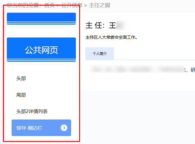
</div>华龙网给出的解决方案是 include。
可是 include 的位置也很有考究,否则就会:
‼️
华龙网给出的解决方案是,需要 include 的 侧边栏 栏目上挂。
什么意思?
一般一个栏目只有一个页面,也就是 web。但是一个栏目是可以挂多个页面的。
比如挂一个 h5 或 JSON :
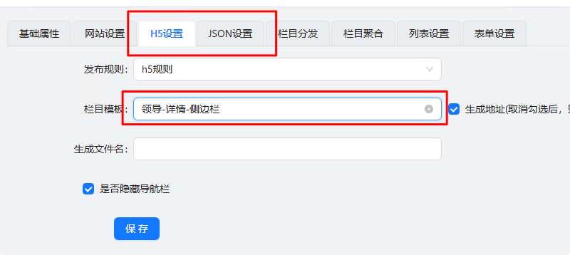
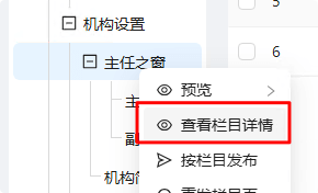
此时“查看栏目信息”
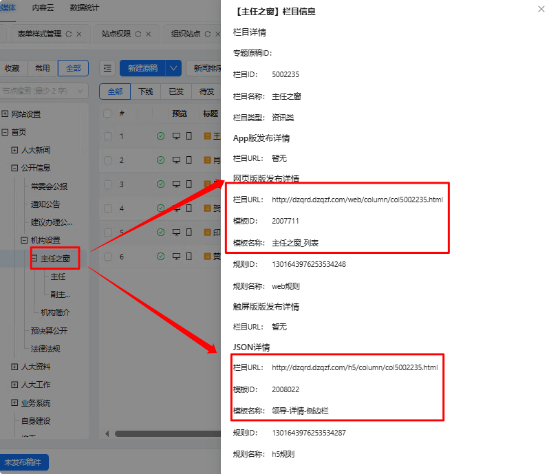
此时侧边栏的 位置 便获取到想要的栏目了
代码参考
html
<hlx-template
  component-type="column"
  component-query-option="{ }"
  component-variable="sidebarCurrentCol"
></hlx-template>

<hlx-template
  component-type="column"
  component-query-option="{'columnScope':'PARENT'}"
  component-variable="sidebarParentCol"
></hlx-template>

<hlx-template
  component-type="columns"
  component-query-option="{'columnIds':[],'showMedium':'PC','columnScope':'BROTHER'}"
  component-variable="sidebarColList"
></hlx-template>

<div class="hlx-page2-sidebar-title" th:text="${sidebarParentCol.name}"></div>

<div class="hlx-page2-sidebar-list">
  <th:block th:each="item: ${sidebarColList}">
    <th:block th:if="${item.id} == ${sidebarCurrentCol.id}">
      <a th:text="${item.name}" th:href="${item.urlPc}" class="active"></a>
    </th:block>
    <th:block th:if="${item.id} != ${sidebarCurrentCol.id}">
      <a th:text="${item.name}" th:href="${item.urlPc}"></a>
    </th:block>
  </th:block>
</div>html
<!DOCTYPE html>
<html lang="zh-CN">
  <head>
    <meta charset="UTF-8" />
    <meta
      name="viewport"
      content="width=device-width, initial-scale=1.0, maximum-scale=1.0, user-scalable=no"
    />

    <title th:text="|${article.title}_{{ conf.title }}|">
      {{ conf.title }}
    </title>

    <link rel="icon" href="/assets/img/favicon.ico" />

    <!-- 华龙芯统计Buried point article 开始 -->
    <meta name="clientId" content="{{conf.appId}}" />
    <!-- appid 固定值 -->
    <meta name="businessId" th:content="${article.id}" />
    <!-- 必须 业务id,businessType为NEWS时为稿件id,businessType为COLUMN时为栏目id -->
    <meta name="title" th:content="${article.title}" />
    <!-- 暂时不用,留着备用,默认为<title></title>标签中的内容 -->
    <meta name="businessType" content="NEWS" />
    <!-- 华龙芯统计Buried point article 结束 -->
  </head>

  <body>
    <hlx-template
      component-type="news"
      component-query-option="{'newsId':''}"
      component-variable="article"
    ></hlx-template>

    <div class="hlx-start-root-v1_3" style="background-color: #F9FBFF;">
      <hlx-template
        component-type="column"
        component-query-option="{}"
        component-variable="currentColumn"
      ></hlx-template>

      {% include 'diff/h2.liquid' %} {% include 'diff/breadcrumbs.liquid' %}

      <div class=" row no-gutters hlx-page2-box w1400">
        <div class="col-12 col-md-2">
          {% assign hlx_include_leader_detail_sidebar = '<!--#include virtual="/h5/column/col5002235.html" -->'
          %} {{ hlx_include_leader_detail_sidebar }}
        </div>
        <div class="col-12 col-md-10 pd-0 pl-md-2 ">
          <div class="leader-detail-content">
            <div class="name">
              <span>主 任</span>:<span th:text="${article.title}"> </span>
            </div>

            <div class="intro" th:text="${article.summary}"></div>

            <div class="label">
              <span class="txt">个人简介</span>
            </div>

            <div class="content" th:utext="${article.content}"></div>
          </div>
        </div>
      </div>

      {% include 'diff/f.liquid' %}
    </div>
  </body>
</html>scss
@use "base/index" as *;

$radius: 4px;
$sidebar-pd: 16px;

// 侧边栏标题
.hlx-page2-sidebar-title {
  background: #0f71ff;
  border-radius: $radius;
  color: #ffffff;
  position: relative;
  padding: 20px;
  text-align: center;
  font-size: 28px;

  $sidebar-line-gap: 3px;
  $sidebar-line-height: 2px;

  &::before {
    content: "";
    position: absolute;
    bottom: $sidebar-line-gap + $sidebar-line-height + $sidebar-line-gap;
    left: 0;
    width: 100%;
    height: $sidebar-line-height;
    background: #ffffff;
  }

  &::after {
    content: "";
    position: absolute;
    bottom: $sidebar-line-gap;
    left: 0;
    width: 100%;
    height: $sidebar-line-height;
    background: #ffffff;
  }
}

// 侧边栏列表
.hlx-page2-sidebar-list {
  font-size: 16px;
  margin-top: 12px;
  background-color: #fff;
  padding: $sidebar-pd;
  border-radius: $radius;

  $sidebar-item-icon-w: 24px;
  $sidebar-item-icon-mr: 12px;

  a {
    display: block;
    position: relative;
    padding: $sidebar-pd ($sidebar-item-icon-w + $sidebar-item-icon-mr)
      $sidebar-pd $sidebar-pd;

    &.active,
    &:hover {
      background-color: #669df8;
      color: #ffffff;
      border-radius: $radius;

      &::before {
        content: "";
        position: absolute;
        top: 50%;
        right: $sidebar-item-icon-mr;
        transform: translateY(-50%);
        width: $sidebar-item-icon-w;
        height: $sidebar-item-icon-w;
        background: url(../img/page2/sidebar-sidebar.png) center center / auto
          100% no-repeat;
      }
    }
  }
}

.hlx-page2-box {
  .content {
    background-color: #fff;
    border-radius: $radius;
    padding: 20px;

    .hlx-list-item {
      margin-top: 12px;
      &:first-of-type {
        margin-top: 24px;
      }

      &:nth-of-type(7n) {
        margin-bottom: 24px;
      }
    }
  }
}

@media screen and (max-width: 768px) {
  .hlx-page2-box {
    .content {
      padding: 12px;
    }
  }
}scss
@use "base/index" as *;

.hlx-detail-container {
  @extend %detail-container;

  .hlx-detail-title {
    font-size: 28px;
    text-align: center;
    color: #000000;
  }

  .hlx-detail-infos {
    margin-top: 36px;
    margin-bottom: 24px;

    font-size: 16px;
    color: #000000;
    .label {
      padding: 0 12px;
      font-size: 16px;
    }
  }

  .hlx-line {
    border: 1px dashed #b7b7b7;
  }

  .hlx-news-detail {
    padding-top: 48px;

    img {
      max-width: 100%;
    }

    video {
      display: block;
      width: 500px;
      margin: 0 auto;
    }
  }
}

@media (max-width: 768px) {
  .hlx-detail-container {
    .hlx-news-detail {
      video {
        width: 100%;
      }
    }
  }
}

.leader-detail-content {
  background-color: #fff;
  padding: 24px;
  border-radius: 4px;
  margin-bottom: 24px;

  .name {
    font-size: 24px;
    color: #000000;
  }

  .intro {
    margin-top: 12px;
    font-size: 14px;
    color: #000000;
  }

  .label {
    margin-top: 24px;

    border-bottom: 2px solid #e0ebfc;

    .txt {
      display: inline-block;
      box-sizing: border-box;
      font-size: 12px;
      padding: 12px 24px;
      background-color: #e0ebfc;
      color: #000000;
    }
  }

  .content {
    img {
      max-width: 100%;
    }
  }
}